The weakest link in your data pipeline: the last mile
Data that can't be understood has no value
In my very first user interview for my first product: PureMetrics, I heard the dreaded phrase: “I have never seen this dashboard before”. My heart sank.
That problem has been with me for close to a decade. I have struggled to get people to look at and use my dashboards.
It is said when a dashboard breaks in the forest, no one notices. No one notices because, no one was looking at said dashboard.
Jokes and crappy analogies aside. People don’t use dashboards due to one of the following reasons:
People are “afraid of data” because they never understood all the charts shown to them, and they were made to feel like the dumbest person in the room.
People struggle to understand all the data vomited on the dashboard. Usually, the dashboard gets tuned to the most intelligent person using it, they ask for more data, and more charts get added, which increases the perception of complexity, and alienates the others who are struggling.
People don’t trust the data, and sometimes it is not even your fault as a 3rd party decided to change something or not work at all
People’s expectation of the dashboard is different from what is being delivered or what is even possible.
People want insights to come to them, rather than them going to and sifting through data.
At the end of the day, each issue starts with “People”, which is why I think this is a great meme
We as Data Engineers, Analysts, and Purple people worry so much about the large part of the iceberg which is under the water, we forget that the small portion above the water, the insight, is where value lies.
The amount of effort put in to make sure that people understand the insights being shared pales in comparison to the blood, sweat, and tears put into collecting all the data and gathering critical business insights. This is the reason folks are drowning in data and thirsty for insights. We tend to be in service of the data, rather than in service of the users who can convert the data to business outcomes.
Last Mile Solutions
Providing Context: Data Package at the last mile
Most data handovers are just data and rarely provide context, or connected information.
When sharing information with your team it is best to build a Data Package [DP]. A DP consists of the following:
Data
Context
What are they looking at
Why is the data showing what it is showing
Connected data that can add to the information shared
Google Finance is a great place to see how this kind of package is used. Just a small portion of the page is the stock insight, the rest provides context to the end user. In addition, the chart itself shares the key events in the stock’s history, more context for the end user.
Providing Trust at the Last Mile
The worst place you can be in is when your users don’t trust your data. Your data might be providing the wrong insight because it is not fresh or it is wrong
This can be solved easily by providing information to your users. With BI tools, this can be a challenge. In the past, I have resorted to using custom queries and text in non-trivial ways to let my users know there is an issue. I have either added Text & emojis …
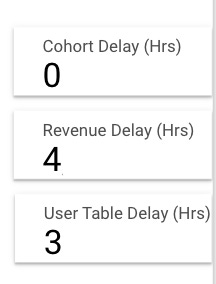
.. or used Scorecards as indicators.
Other Dashboards make sure users know when the data is fresh…
… or not ready yet
Providing on-demand follow-up information
A good data insight, like a good presentation, is one that gets people asking questions.
Unfortunately, most tools don’t allow for a discussion, it is a one-way street. As a result, most of the discussions happen on streams of conversations where knowledge gets lost with time (I am looking at you Slack).
My Solution
My “current” solution has been to build reports filled with screenshots from my BI tools and Spreadsheets, and my commentary on what is happening. I even go as far as providing a TLDR for each report which is the most concise the report can get. It is the Data package, delivered as a PDF.
Are you in the same boat? I would love to learn how you solved your problems, email me at substack@ravivyas.com.
Photo by Jackson Simmer on Unsplash


For this reason, I love using Amplitude s Notebooks. However, the data has to be all in Amplitude.
Great post Ravi.